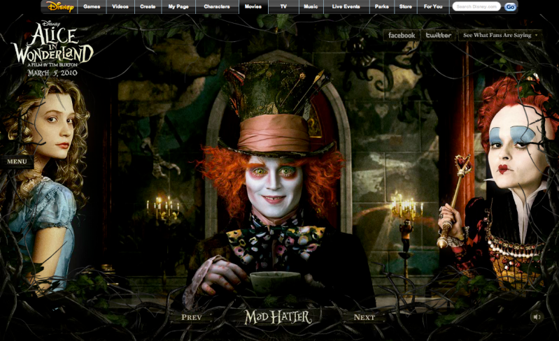
Here's two great websites that I've stumbled across recently. A lot of websites seem to be going pretty clinical these days, favouring the modern minimalist look (including this very blog) ...and for a good reason too, usability and simple navigation usually have something to do with it. However, these two sites do the opposite, I actually want to spend time clicking around finding out which bits I can click and which I can't.
So maximalist or minimalist... for me it depends on my mood. It's got to reflect your personality right?
What if we created websites that matched our mood? Neat & tidy vs. Full on & Hectic.




No comments:
Post a Comment